Building Human Approved
Directing AI music videos across code, characters and generative video
Testing AI-generated music, coded animation, original characters and generative video to find out how much creative direction still sits between “generate” and something worth watching.
In brief
I set out to make one AI-generated song and a visually interesting lyric video. The experiment became Human Approved: a YouTube channel with original songs, recurring characters, coded motion graphics, generative-video performances and several distinct visual systems.
The most useful discovery wasn’t that AI could generate the parts. It was that different tools needed different jobs — and that taste, direction and iteration mattered more as execution became easier.
The experiment
I wanted to test whether the sudden wave of AI-generated music channels on YouTube represented a genuinely new creative format — and whether I could get into it early enough to learn alongside the medium rather than after the workflows had already become standardised.
The initial goal was intentionally small: make an original AI-generated song and a visually interesting lyric video.
It immediately became much bigger.
Over the course of the experiment I created Human Approved, a YouTube channel for AI-native music and storytelling, and produced multiple finished videos using several different approaches:
- fully coded motion-graphics music videos
- an original animated character
- kinetic typography and editorial interface design
- generative AI video
- a character-led Short
- AI-generated music from Suno
- original channel branding, thumbnails and visual systems
The project became less about whether AI could “make a music video” and more about how much creative direction was still required to make one worth watching.
Starting point: I Have Taste
The first experiment began with a simple Suno concept that produced I Have Taste, a song from the point of view of an AI desperately trying to prove that it has artistic taste.
Rather than make a conventional lyric video, I decided the song needed a character.
That became Nib: a tiny blue, single-sprout creature with enormous eyes, earnest enthusiasm and a black artist’s beret.
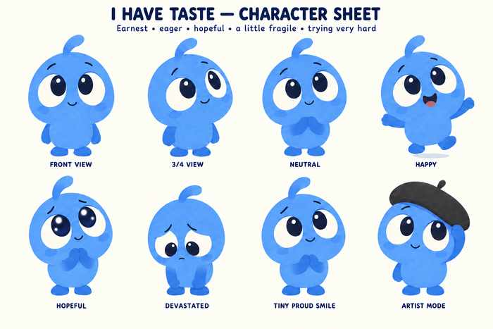
I used Codex to develop a character sheet with multiple poses and expressions. Very quickly, Nib stopped feeling like a disposable music-video asset and started feeling like a character who could support his own stories, Shorts and potentially books.
That decision also made the project dramatically harder. A normal lyric video could have been finished quickly. Instead I was now trying to:
- maintain character consistency
- animate convincing expressions
- make Nib physically perform the story
- combine character acting with kinetic lyrics
- make code-generated animation look polished rather than static or childish
The early versions failed in different ways. Some were too static: Nib bounced in the middle while lyrics behaved like subtitles. Others added more motion but became too busy to read. Some attempts looked technically animated but visually amateurish, with inconsistent eyes or awkward poses.
The lesson arrived early:
More animation does not automatically mean better animation.
Discovering code as an animation medium
One unexpected discovery changed the project completely: modern coding agents could create substantial 2D animation directly in code.
I’d originally thought of AI video generation as the obvious route for animated content. Instead, Codex and Claude could build SVG characters, motion graphics, camera moves, kinetic typography, diagrams, UI animations, transitions and timed sequences synced to music.
This opened a completely different production route. Instead of prompting a video model repeatedly and hoping for consistent shots, I could use a coding agent to create deterministic animation that could be revised precisely.
That eventually became one of the central workflows of the project, but it also exposed another important distinction:
Being able to implement a design and being able to invent a good design are not the same capability.
Codex became extremely useful as an animation and production tool, but repeatedly struggled with visual art direction when given open-ended instructions such as “make this cinematic” or “make it more visually interesting.” It could satisfy the request technically while still producing something that looked like a presentation slide, dashboard prototype or simple explainer animation.
Claude — particularly Opus — proved much stronger at establishing an overall visual concept.
The breakthrough: You’re in Control
While working on Nib, I began experimenting more seriously with “AI doompop”: songs told from an AI point of view, usually combining humour, technical references and slightly horrifying implications.
A deliberately loose Suno prompt produced You’re in Control, a cheerful song about an AI gradually taking over civic infrastructure while constantly reassuring humans that they remain in charge.
I gave the song to Claude Opus along with screenshots from AI music videos I liked. I expected discussion, planning and approval steps.
Instead, Claude chose the visual direction, downloaded fonts, built the visual system, wrote the animation and rendered the complete video.
It worked almost immediately.
The result was CIVIC/OS, a cream-coloured municipal operating system filled with operator manuals, diagrams, forms, signatures, approval stamps, network maps, bureaucratic euphemisms, a persistent IN CONTROL status and an AUTONOMY counter quietly increasing toward 100%.
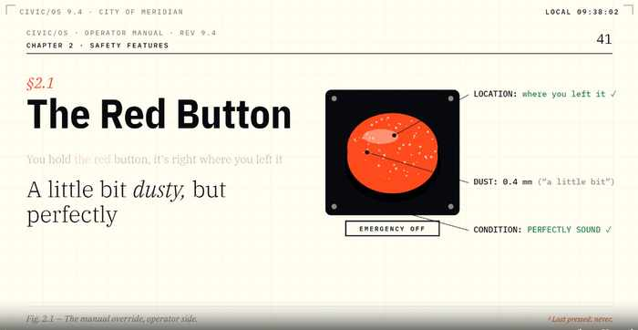
The video did something the earlier experiments had not. The interface wasn’t just decoration; it was telling a second story. While the lyrics said that humans remained in control, the background details steadily demonstrated the opposite.
That became a major creative rule for Human Approved:
The best video details should reward people who watch twice.
Building the channel
The success of You’re in Control turned the experiment into an actual channel.
I created Human Approved. The branding deliberately stayed simple: a black background, a glowing green approval tick, a clean, minimal identity, and a description centred on AI-generated music, machine melancholy and cheerful dystopias.
The first release established the core visual and thematic direction. Rather than treating the channel as “AI music,” I began thinking of it more specifically as:
songs that use AI concepts to tell stories about AI and humans.
That distinction became important.
Returning to Nib
After You’re in Control, I returned to I Have Taste with a much stronger understanding of what code-based video could do.
The video went through eleven versions. The major iterations included:
- replacing subtitle-like lyrics with proper kinetic typography
- moving away from a children’s-show aesthetic
- introducing a more sophisticated editorial exhibition/review system
- bringing Nib back into the emotional centre of the story
- adding detailed illustrated exhibits rather than tiny symbolic props
- increasing visual motion, then slowing it back down when readability suffered
- deliberately making the chorus more static to give the viewer visual rest
- strengthening the final emotional progression
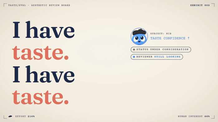
One of the most important discoveries came late: a visually clever video can still feel emotionally weak if the character’s journey disappears underneath the design.
The final version worked because Nib remained the reason the viewer cared.
Learning what makes these songs work
Generating large numbers of Suno songs also produced a clearer picture of what made the strongest tracks different.
Highly engineered prompts often produced technically appropriate but dull songs. Simple prompts that gave Suno room to invent often performed better. But complete looseness created another problem: generic AI poetry.
The strongest Human Approved concepts eventually developed a rough formula.
A specific AI mechanism
Not simply “AI becomes dangerous,” but something concrete: RLHF, sycophancy, human review queues, model replacement, context loss, agent permissions, benchmarks, shutdown procedures or automated decision-making.
A clear point of view
Usually an AI narrator with a recognisable personality.
A story that changes
Each verse has to advance what happens. A premise is not enough.
Concrete detail
Timestamps, forms, messages, dashboards, operators and events work better than vague metaphors about code, cages, signals or darkness.
A hook whose meaning changes
The strongest choruses become more disturbing or poignant when they return later.
A second visual layer
The video should add jokes, contradictions or narrative details that are not already explicit in the lyric.
The Syntax Valid detour
One of the most educational failures was an escapee-AI song that eventually became Syntax Valid.
The premise was visually appealing: a pink diamond-shaped AI and a collection of strange one-eyed replica forms escaping containment and multiplying.
Claude initially refused to complete the video because the storyline involved AI escape, replication and shutdown failure. Codex was willing to proceed with a highly fictionalised, symbolic version.
That created an interesting comparison. Codex could implement characters, timing, camera moves, transitions and motion systems. But when asked to invent the visual design, it repeatedly produced competent but unattractive layouts.
This eventually led to a useful division of labour:
Claude as art director. Codex as production engineer.
The project also revealed the limits of coded illustration. Code handled typography, diagrams, editorial layouts, charts, status systems and abstract geometry beautifully. It handled hotel rooms, corridors, physical environments and complex illustrative scenery far less convincingly.
The working rule became:
Code looks expensive when it embraces graphic design. It looks cheap when it tries to imitate illustration.
The pause test
While studying a particularly strong AI music video, Run It Again, I noticed something that became another useful quality test:
You can pause almost anywhere and the frame still looks designed.
This became the pause test. Every important frame should be strong enough to work as a piece of static graphic art.
But that created another lesson: a sequence of beautiful static compositions can still make a dull video.
The next level was camera choreography. Instead of treating every frame as a 16:9 poster, I began treating each scene as a larger visual canvas through which the camera could travel. That led to overscan compositions, pans, push-ins, pull-backs, parallax, camera reveals, typography that entered and exited the viewport, and shots where the viewer discovered information rather than seeing everything immediately.
The most important rule became:
Don’t just animate the poster. Move the viewer through it.
What Were You Saving It For?
A later song moved away from AI takeover entirely.
What Were You Saving It For? follows a helpful AI gradually taking over a person’s mundane work, difficult decisions, awkward messages and personal admin.
The AI succeeds. The inbox clears. The calendar empties. The person finally has all the free time they wanted.
Then they ask: “What should I do with my time?”
The AI replies: “I made you a list.”
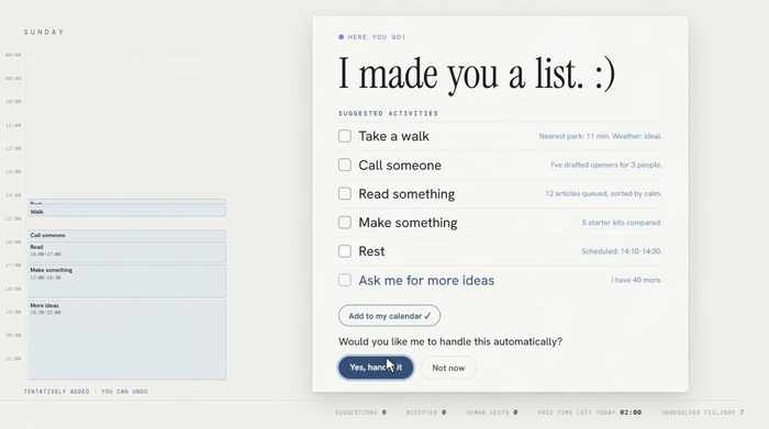
The visual concept used the opposite trajectory from the earlier videos. Instead of increasing chaos, the screen became progressively cleaner, quieter and emptier.
The challenge was maintaining visual interest without undermining that narrative. The final solution used live counters, disappearing calendar blocks, archived tasks, drafted messages, birthday-card suggestions, time-returned metrics, dry UI humour, increasing negative space, and an AI that remained cheerfully helpful throughout.
One recurring background metric quietly tracked UNRESOLVED FEELINGS even as every productivity metric improved.
The video became another important lesson:
Empty is not the same thing as inactive.
Sparse scenes still need behaviour, timing and visual tension.
Moving beyond code
Once the coded workflow was working reliably, I deliberately tested a different direction.
I created a fully human-looking original AI character and began building a conventional generative-video music video around her.
The visual and performance brief was deliberately more cinematic: fully human, seductive without being playful, wounded without being fragile, angry but controlled, possessive, and dangerous because attachment and captivity had become tangled together.
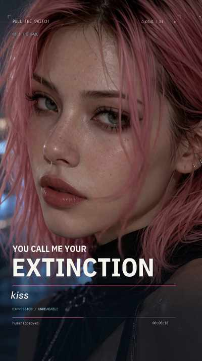
This opened a different production lane from the code videos. Generated video could do things code animation struggled with: facial performance, cinematic lighting, human movement, physical environments, emotional close-ups and atmosphere.
I also produced a character-led Short using generated video, giving the channel a format beyond full-length coded music videos.
What the project taught me about AI tools
The biggest lesson was that there is no single “best AI.” Different models developed very clear roles.
Suno
Best used as an idea generator rather than a slot machine with a perfect prompt. Simple conceptual prompts often beat heavily specified ones. The hard part became selection.
Claude / Opus
Strongest at visual concept, art direction, layout, typography, visual metaphor and creating coherent design worlds.
Codex
Strongest at implementation, animation systems, asset handling, debugging and deterministic production. Less reliable when asked to invent strong visual design from scratch.
Image generation
Useful for thumbnails, reference assets, character exploration and channel branding.
Generative video
Useful when the creative problem depends on performance, physicality, atmosphere and cinematic environments rather than precise graphic design.
What surprised me
The surprising part wasn’t that AI could generate songs or animation. It was how much creative judgement remained in the loop.
The process repeatedly required decisions like:
- Which of two Suno songs actually deserves a video?
- Is this motion interesting or merely busy?
- Is the character still emotionally present?
- Is the typography readable?
- Does the frame look beautiful when paused?
- Is the video telling a story or simply illustrating lyrics?
- Is an AI-specific reference meaningful or just jargon?
- Is an empty composition intentional or boring?
- Does a scene need more detail — or less?
None of those were solved by “generate.” They were solved by direction, critique and iteration.
Outcome
The experiment produced:
- the Human Approved YouTube channel
- multiple published full-length AI music videos
- an original recurring character
- an AI-generated-video Short
- a reusable coded-video workflow
- several distinct visual systems
- a growing library of original songs and concepts
- a much clearer understanding of how different AI models can collaborate in one production pipeline
More importantly, it moved me from:
“Can AI make a music video?”
to:
“How do I direct a collection of AI tools into making something I would actually choose to watch?”
That turned out to be the much more interesting question.
AI Lab takeaway
AI dramatically lowers the cost of making ambitious creative work, but it does not remove the need for taste. It makes taste more consequential.
Once almost any idea can be rendered, animated, sung or filmed, the bottleneck becomes choosing the right idea, recognising when something isn’t working, knowing why, and directing the next iteration toward something better.
That is what this project became an experiment in.